Another day, another lackluster SPECTRE teaser poster. Let’s trace this back to the roots.
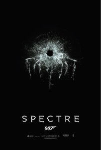
Teaser #1:
The first teaser poster was unveiled at the Bond 24 presser. The name, cast and this beautifully simple recall to On Her Majesty’s Secret Service laced with the SPECTRE octopus logo were shown to fans for the first time. I can’t speak for everyone, but I was smitten with this design. The perfect “teaser” for the upcoming Bond film. A mix of old and new. And despite my reservations about bringing SPECTRE and Blofeld back into the fold, I found myself thinking that just maybe…. maaaaaybeeeee…. they could pull off this resurrection.
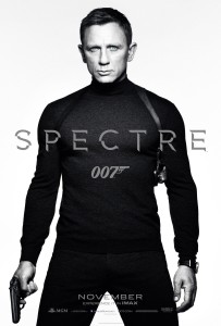
Teaser #2:
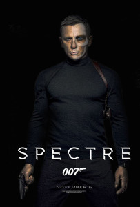
The second poster appears in a couple of different color variations. White background, color with a gray background. The general synthesis, however, is that Craigers is channeling Roger Moore in Live and Let Die (great!) but reminds heartily of Archer’s tactleneck obsession. It led #Bond_age_Pod to do an entire episode devoted to the Tactlenecks. (Also, you’re welcome for that, by the way.) While there’s little imagination at play here, the nostalgia works. I’ll give it a passing grade because this SPECTRE teaser just recalled the Roger Moore years, and a metric ton of general movie fans who’d sooner spit than admit Roger Moore was Bond ate it up.
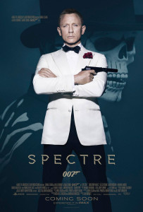
Teaser #3:
This bring us to the reveal of this little ditty today. Hello, Craigers. Nice to see they have you just standing there admiring yourself in the mirror (Travis Bickle style) while a Day of the Dead skeleton looms behind you. Did it take your graphic artists all of 12 minutes to create that design? Two pictures. Fade one nicely into a hazy blue. Slap a sun-bleached Craigers on top. Done! Print! Send! While I support the use of imagery from the highly publicized Dia de los muertos scenes from the upcoming film, I abhor lazy movie poster design. Movies posters died in the 90’s when computer and photo-editing software rendered commissioned artists a frivolous expense. I ranted about this very subject a bit on Twitter and boasted that I could do better with 20 minutes and a little bit of Photoshopping. So I gave myself 20 minutes and came up with this:
Truth time. This took me 27 minutes. If I was doing this for anything other than for funsies, I’d make Daniel Craig fade more seamlessly into the background and I’d use the skeleton mask from the SPECTRE image. But I don’t have that original image. I’m not working for crazy dollars at some graphic design firm that MGM’s paying thousands of dollars to do… well… very little. I don’t blame the designers at all. They’re working on MGM’s dime and delivering a product according to specifications, very boring specifications.
Let’s go even further back, shall we?
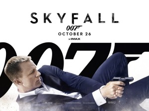
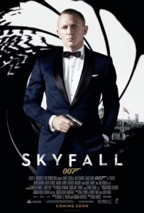
@ThatNeilGuy reminded me during my movie poster rampage today that Bond also phoned in most of the Skyfall posters too. So I went back and reminded myself. The only Skyfall poster I truly remembered was the Advance.
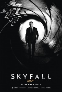
Advance Skyfall:
Which, I consider pretty slick and rather iconic due to its minimalist simplicity. Then I realized why this was the only Skyfall poster I remembered vividly.
Oh look! It’s Craigers. Front and center. Same. Damn. Setup. Instead of a Day of the Dead skeleton or a blank background, it’s a slight variation on the gun barrel with a wee bit o’ London (is that MI-6?) slapped in, which you probably just overlooked until now.
By comparison, this poster’s balls to the wall. Craigers appears to be walking toward the camera! SLOW DOWN, CRAIGERS, YOU’LL WALK INTO THE CAMERA! Yet it’s another gun barrel backdrop. At least this one’s a little more visually appealing. If we’re being critical, however, there’s very little difference in overall technique and it appears that Bond’s Skyfall estate is being smeared around inside a gun barrel/subway tube. An allusion to the subway chase, perhaps. Maybe I should give this image a little bit more credit for including more than one element from the film. Even if those elements are largely unintelligible and wholly fail to catch the eye.
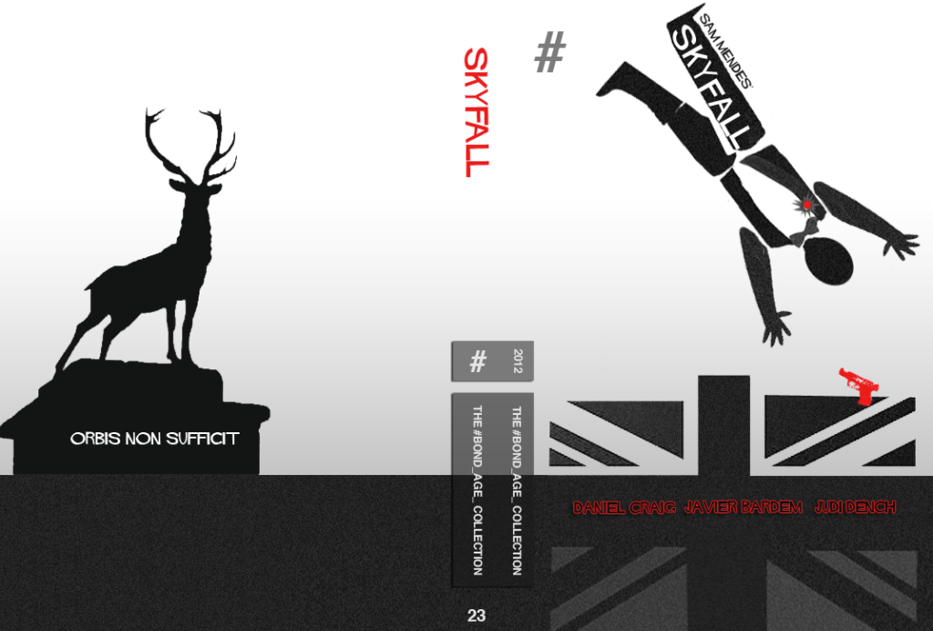
To me, Skyfall deserved a Saul Bass-variety treatment. I designed this as a Custom DVD cover for the #Bond_age_ Collection. (Not that this could be used as a movie poster for a major motion picture, of course.)
Overall, the takeaway from this post is not groundbreaking. The art of movie poster design is dead. It is; let’s not try to pretend otherwise. It lives on, however, in the aspiring artists and Photoshop masters that reside on the Interwebs. Search for any Bond movie and “fan art” and you’ll come up with dozens of inspired pieces of design. Digital art by people far more skilled than I, which just further begs the question… with all this skill and digital tools at our disposal why do studios fear visual innovation? There are dozens of online shops selling the work of amateur designers (mostly on t-shirts). The success of companies like Threadless and RedBubble is a testament to the fact that people recognize and appreciate quality design. Is this poster malaise happening for the same reasons that American Runs on Dunkin’ and the movie business runs on franchises, sequels and known commodities? Do the studios have hard evidence that stale, familiar movie posters sell more tickets? Or is it part of a greater underlying malaise of the patrons of film, that the general moviegoing public just doesn’t care anymore? That all we want to see are floating heads and the stars of the film front and center, recognizable instantly at 40 paces… or across a 20-screen multiplex.
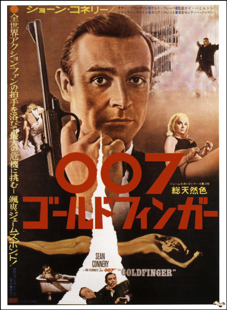
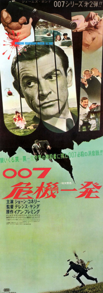
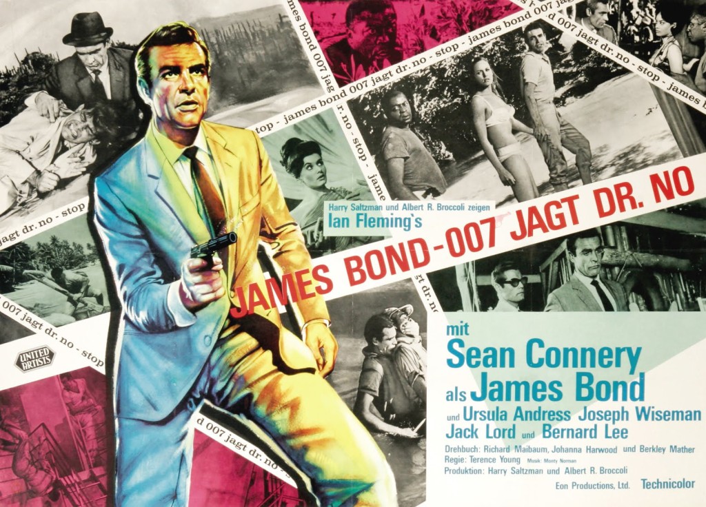
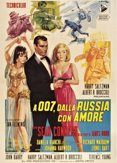
I can’t be alone here. There must be a heavy wave of nostalgia for those old Bond posters, the too-busy design, the commissioned artwork, the action highlights laced throughout a gripping montage of baddies and babes. Share your favorite Bond posters in the comments. I’ll slap a few of my favorites below as a tribute to days, not so long ago, when poster design remained an art form instead of a mindlessly basic Photoshop exercise.

